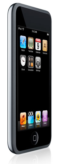
 So yeah. New ipod touch. All hail Apple.
A little over 24 hours have passed since I bought this thing yesterday, so I think I have a sufficient amount of experience with it to put together some first-impression-type feedback.
To say that the ipod touch is a thing of beauty is largely stating the obvious, but I figure I’m allowed one small gush: this thing is marvelously engineered. Its face is bevelled black glass and a single Home button, while the back is the traditional stainless steel surface shared by other full-sized ipods. The software is mostly identical to the iPhone, except for the fact that the iPod has much fewer applications (Safari, YouTube, Photos and the standard PIM apps are all you get), and of course it has no telephony functions. The multi-touch interface is a real wonder too — after you’ve gotten used to the idea that everything on the screen will respond to your finger tips, it becomes second-nature.
Installation was, as always, crazy simple: Without bothering to read any documentation, I pulled the iPod out of its padded box (all black in there, as well) pressed the Home button and was promptly informed that I needed to connect it to iTunes. I popped its USB cable in, registered the device and started setting up the various sync processes.
The main thing that you have to keep in mind with the touches is that they’ve got fairly tiny storage: just 8gb and 16gb available. This immediately ruled out syncing my whole collection across, as I have about 75gb of music stored in 3 separate devices. So setting up proper synchronization rules was going to be key: after a bit of thought I decided that I’d create a smart-playlist. (A smart-playlist is a dynamic playlist that responds to criteria set by the user. In my case, I wanted a playlist that contained only the songs that I had added within the last 90 days, any songs that were rated 4 or 5 stars, and any podcasts that hadn’t been listened to yet.) Once the list was setup, it was just a matter of pointing the iPod at it so that it would automatically sync whatever happened to be in the playlist at a given moment.
The other consideration was how to handle videos. I watch a lot of TV shows, but they’re usually in formats that the iPod can’t handle (XviD isn’t a particularly mainstream codec), so if I wanted to watch anything on the touch, I’d have to convert the videos before copying them over. Unfortunately, this was not as easy as I thought — the main challenge being the fact that converting movies take time, and I couldn’t figure out how to properly automate the process. (My definition of automation: any video files in my "TV Shows" folder is converted to MP4, added to my iTunes library and then deleted from the folder. I found an Automator script that looked like it might solve the problem, but I honestly didn’t have time to test it out.)
The video converter I’m currently using is iSquint, a freeware app that takes about 9-10 minutes to convert an XviD-encoded 45-minute episode to an iPod-ready MP4. (For now, I’m manually doing the conversion; my only other option would be getting all my shows from Podtropolis or ipodnova, which isn’t all that appealing.)
Actually watching the video on the ipod proved to be a real joy: the screen isn’t the best I’ve seen, but the frame-rate is flawless and the player is very responsive when you’re seeking. Like iTunes itself, the touch remembers where you left off for each video in its library, so you can pause-and-resume your viewing at will. If you’ve ever watched a video on Quicktime or from within iTunes, there’ll be zero-learning curve here, as the controls are nearly identical.
 Of course, this being a review of a portable music device, I should probably mention that the audio quality is pretty good as well. The included headphones are an updated version of the slightly chunkier white-boxed Sennheisers that came with my 4th-gen model, but the quality seems about the same. Generally speaking, the sonic fidelity you experience is largely dependent on the kind of headphones you’re using, and the included earbuds are average at best. If you’re a mobile audiophile, replacing these with a decent pair of in-ear phones would be your first priority. (I’ve been using a pair of Shure E2C’s for the past 3 years and it looks like I might finally have an excuse to look for a replacement.)
Coverflow works great, and the interface for browsing through your collection of "CDs" is just friggin’ brilliant. I did run into a small annoyance here though: Coverflow on the touch (and I assume, in any of the new iPods) can’t make guesses about album-art in the same way that iTunes on the desktop can. For example: I have 10 tracks from Radiohead’s album, and only one track has the cover-art embedded in it. Desktop iTunes would know that these 10 tracks belong to the same album and displays the correct cover-art even when you’re playing a track that doesn’t have it. iPod Coverflow doesn’t seem to be capable of this logical leap, and so you end up with a ton of tracks with no album art, which can be especially annoying when you’re listening in Shuffle mode. (If you’re wondering why I’m making such a big deal about the album-art … well, let’s just say that being able to flip through album covers with my fingertips was one of the main reasons why I wanted this thing so badly.)
The other thing I didn’t really like was that there was no way to get at the volume controls as quickly as with the standard iPods (all you originally had to do was spin the wheel). Because the touch’s screen doesn’t respond to input unless it’s on, you actually have to press the Home button to "wake it up" during playback. To make matters worse, the volume controls only appear when the ipod is vertically-oriented, so you have to turn it counter-clockwise (if you were in widescreen mode), and only then would you be able to drag the volume slider.
 The mobile Safari browser is the feature I’ve spent the least amount of time with, but I did visit AJAX-enabled sites like gmail and basecamp, and couldn’t spot any show-stoppers in either of them. I also watched movie trailers on the Apple Quicktime site and was impressed to find that it plays the videos in fullscreen automatically. I also spent sometime configuring a personal start page at mockdock, which lets you collect mobile-enabled sites into a single iPhone-like interface. Fun stuff.
Entering text such as urls or login names was a little difficult at first, as expected. The software buttons on the touch are as large or larger than the hardware buttons on most QWERTY-enabled mobiles, so it shouldn’t take me that much longer to get used to it. At a glance, the browsing experience is easily the best I’ve ever used on a palm-sized device (and I’ve had quite a few devices over the past 4 years to compare it to, believe me). It’s startling how quickly you can get used to the squeeze-and-spread gesture for zooming in and out of pages quickly; when I had to use mobile Opera on my smartphone afterwards, it was downright painful. If Apple has revolutionized anything with the iPhone and its variants, it’s definitely the mobile-browsing paradigm, and when they get around to building the multi-touch interface technology into their full-sized computers, it’ll totally change the way we use those machines as well. I’m still waiting for the time when our workstations will essentially be nothing more than one very large screen that sits in front of us at an angle like an architect’s drafting table, and has a pressure-sensitive, textured surface that’ll impart real tactile feedback; it makes me smile just thinking about it.)
Overall, I’m quite happy with the touch. I know that it doesn’t make sense to a lot of people because of its cost and the fact that you could buy an iPhone in the US at the same price, and that’s totally fine. (My response: the iPhone isn’t available in this country yet and unlocking it is not the hassle- and risk-free experience that people are envisioning. Besides, no amount of unlocking will give it an HSDPA antenna, and that for me, is a deal-breaker.)
The build quality is great, and considering that it’s mostly glass, it feels very solid and light. Apart from those niggling user-interface issues mentioned above, I rather like the ipod touch.
 Heroes Season 2, Episodes 1-4
.png) All-Star Superman, Issues 1-8
All-Star Superman, Issues 1-8 Dexter Season 2, Episodes 1-3

 So after listening to nothing but "
 So yeah. New
  Of course, this being a review of a portable music device, I should probably mention that the audio quality is pretty good as well. The included headphones are an
  The mobile Safari browser is the feature I’ve spent the least amount of time with, but I did visit AJAX-enabled sites like
  Got the